Layout is extremely important for any application. Windows forms had fixed layout system where controls were arranged using X and Y co-ordinates. In such cases, if windows size and resolution changes then layout does not adapt to the changes and looks somewhat disturbed. If window size is reduced then scrollbar would appear and if window size is increased then some space would be left unoccupied. To the rescue, windows forms had 2 useful features like Anchoring and Docking that helped in creating dynamic layouts that adapt to these changes. Later on, FlowLayoutPanel and TableLayoutPanel were introduced adding more flexibility in designing applications.
WPF introduced Flow based layout system comprising of different layout controls that are used to arrange child elements in Window. These layout controls play an important role in determining position, size and orientation of child elements with respect to layout control. Hence controls are now positioned relative to their parent layout control instead of absolute position in window. This results in flexible layout of WPF application.
Different Layout controls provided in WPF are StackPanel, DockPanel, WrapPanel, Canvas, Grid, UniformGrid
Panel is the base layout control. All other layout controls derive from Panel control.
1. StackPanel
StackPanel stacks the child elements in horizontal or vertical direction depending on the Orientation specified.
<StackPanel>
    <TextBlock Text="Enter your name" Margin="5"></TextBlock>
    <TextBox Margin="5"></TextBox>
    <Button Content="Say hello"></Button>
</StackPanel>

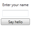
By default, Orientation property is set to Vertical. Hence child controls are arranged vertically. StackPanel is designed to grow and hence in this case when child controls are added, StackPanel would start growing in vertical direction.
And by default both HorizontalAlignment property is set to “Stretch”. Hence all child elements occupy entire horizontal space.
If we change HorizontalAlignment to Left then all controls would be resized and aligned to left.
<StackPanel HorizontalAlignment="Left">
    <TextBlock Text="Enter your name" Margin="5"></TextBlock>
    <TextBox Margin="5"></TextBox>
    <Button Content="Say hello"></Button>
</StackPanel>
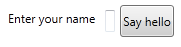
Orientation = “Vertical” and HorizontalAlignment=”Stretch” works together.
If we change Orientation to Horizontal then all controls are arranged horizontally. By default VerticalAlignment property is set to “Stretch”. Hence all controls occupy entire vertical space.
<StackPanel Orientation="Horizontal">
    <TextBlock Text="Enter your name" Margin="5"></TextBlock>
    <TextBox Margin="5"></TextBox>
    <Button Content="Say hello"></Button>
</StackPanel>
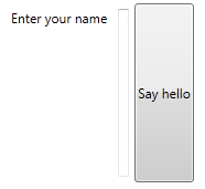
If we change VerticalAlignment to Top then all controls would be resized and aligned to top.
<StackPanel Orientation="Horizontal" VerticalAlignment="Top">
    <TextBlock Text="Enter your name" Margin="5"></TextBlock>
    <TextBox Margin="5"></TextBox>
    <Button Content="Say hello"></Button>
</StackPanel>
Orientation = “Horizontal” and VerticalAlignment=”Stretch” works together.
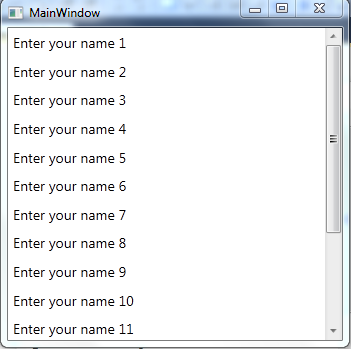
Adding ScrollBar to StackPanel
ScrollBar is designed to grow when child controls are added to it. Hence StackPanel does not support scrolling. There might be the scenario where we need to add lots of items to StackPanel (statically or dynamically). In this case, if StackPanel grows beyond screen size then those items would not be visible. StackPanel can be wrapped inside ScrollViewer to add scrolling.
<ScrollViewer>
    <StackPanel>
        <TextBlock Text="Enter your name 1" Margin="5"></TextBlock>
        <TextBlock Text="Enter your name 2" Margin="5"></TextBlock>
        <TextBlock Text="Enter your name 3" Margin="5"></TextBlock>
        <TextBlock Text="Enter your name 4" Margin="5"></TextBlock>
        <TextBlock Text="Enter your name 5" Margin="5"></TextBlock>
        <TextBlock Text="Enter your name 6" Margin="5"></TextBlock>
        <TextBlock Text="Enter your name 7" Margin="5"></TextBlock>
        <TextBlock Text="Enter your name 8" Margin="5"></TextBlock>
        <TextBlock Text="Enter your name 9" Margin="5"></TextBlock>
        <TextBlock Text="Enter your name 10" Margin="5"></TextBlock>
        <TextBlock Text="Enter your name 11" Margin="5"></TextBlock>
        <TextBlock Text="Enter your name 12" Margin="5"></TextBlock>
        <TextBlock Text="Enter your name 13" Margin="5"></TextBlock>
        <TextBlock Text="Enter your name 14" Margin="5"></TextBlock>
        <TextBlock Text="Enter your name 15" Margin="5"></TextBlock>
        <TextBlock Text="Enter your name 16" Margin="5"></TextBlock>
    </StackPanel>
</ScrollViewer>
2. WrapPanel
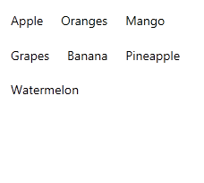
WrapPanel arranges child elements horizontally or vertically depending upon the Orientation property and wraps the content to next line when enough space is not available. By Default, Orientation property is set to Horizontal.
<WrapPanel>
    <TextBlock Text="Apple" Margin="10"></TextBlock>
    <TextBlock Text="Oranges" Margin="10"></TextBlock>
    <TextBlock Text="Mango" Margin="10"></TextBlock>
    <TextBlock Text="Grapes" Margin="10"></TextBlock>
    <TextBlock Text="Banana" Margin="10"></TextBlock>
    <TextBlock Text="Pineapple" Margin="10"></TextBlock>
    <TextBlock Text="Watermelon" Margin="10"></TextBlock>
</WrapPanel>
Setting Orientation property of WrapPanel is set to Vertical.

3. DockPanel
DockPanel allows child elements to be Docked the edges of DockPanel. In windows forms Docking was achieved using Dock property on individual dockable controls. Position of controls that are docked inside DockPanel remains same even when the window is resized. This is useful in scenarios where application wants that toolbar should always remain on top, statusbar always remains on bottom and so on.
DockPanel provides attached property called Dock which is used by child controls.
<DockPanel>
    <Button Content="Button 1" DockPanel.Dock="Top"></Button>
    <Button Content="Button 2" DockPanel.Dock="Left"></Button>
    <Button Content="Button 3" DockPanel.Dock="Bottom"></Button>
    <Button Content="Button 4" DockPanel.Dock="Right"></Button>
</DockPanel>

One important point to note here is how controls occupy space in DockPanel. Button 1 docs itself to top and occupies entire space horizontal space. Then Button 2 dock itself to left occupies remaining space left in vertical direction. Then Button 3 docks itself to bottom and occupies remaining horizontal space at bottom. And finally Button 4 that docks itself to right and occupies entire space. This is because LastChildFill property is by default set to True.
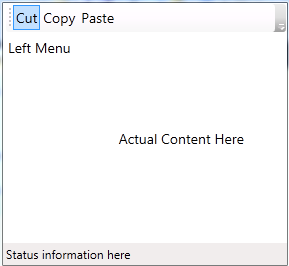
Example usage of DockPanel in actual applications:
<DockPanel>
    <ToolBar DockPanel.Dock="Top">
        <Button Content="Cut"></Button>
        <Button Content="Copy"></Button>
        <Button Content="Paste"></Button>
    </ToolBar>
    <StatusBar DockPanel.Dock="Bottom">
        <TextBlock Text="Status information here"></TextBlock>
    </StatusBar>
    <StackPanel DockPanel.Dock="Left">
        <TextBlock Text="Left Menu" Margin="5"></TextBlock>
    </StackPanel>
    <Grid>
        <TextBlock Text="Actual Content Here" HorizontalAlignment="Center" VerticalAlignment="Center" />
    </Grid>
</DockPanel>
4. Canvas
Canvas control is used for absolute positioning of child controls. Position of child controls in canvas is fixed with respect to edges of Canvas. Controls in Canvas are positioned using 4 attached properties. Canvas.Left, Canvas.Top, Canvas.Right, Canvas.Bottom.
<Canvas>
    <Rectangle Width="100" Height="100" Fill="Green" Canvas.Left="50" Canvas.Top="50"></Rectangle>
    <Ellipse Width="100" Height="100" Fill="LightGreen" Canvas.Left="100" Canvas.Top="100"></Ellipse>
</Canvas>

In above example, Rectangle and Ellipse are absolutely positioned with left and top edges of Canvas. As position is fixed in Canvas, there is possibility for controls to overlap depending on the co-ordinates specified. In above example Rectangle is rendered first and then Ellipse and hence Ellipse is on top of Rectangle.
Canvas provides an additional property Canvas.ZIndex which controls how overlap occurs. ZIndex takes arbitrary integer value. Controls with higher ZIndex will be appear on top of the other control. We can set ZIndex of Rectangle as 1. Whereas Ellipse does not have any ZIndex property set explicitly. Hence Rectangle will be on top of Ellipse.
<Canvas>
    <Rectangle Width="100" Height="100" Fill="Green" Canvas.Left="50" Canvas.Top="50" Canvas.ZIndex="1"></Rectangle>
    <Ellipse Width="100" Height="100" Fill="LightGreen" Canvas.Left="100" Canvas.Top="100"></Ellipse>
</Canvas>

Canvas control is normally not used for layout of user interface controls but it is mostly used for arranging graphical objects. Canvas is suitable option in developing Drawing related applications like Paint, Visio, SmartDraw
5. Grid
Grid is widely used control for layout of user interface elements. Grid control allows you to define rows and columns and then arrange child controls inside them using Grid.Row and Grid.Column attached properties.
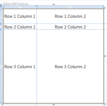
<Grid>
    <!--Defining Rows and Columns-->
    <Grid.RowDefinitions>
        <RowDefinition></RowDefinition>
        <RowDefinition></RowDefinition>
    </Grid.RowDefinitions>
    <Grid.ColumnDefinitions>
        <ColumnDefinition></ColumnDefinition>
        <ColumnDefinition></ColumnDefinition>
    </Grid.ColumnDefinitions>

    <!--Arranging controls using Grid.Row and Grid.Column attached properties-->
    <!--Note: Index starts by 0-->
    <TextBlock Text="Row 1 Column 1" Grid.Row="0" Grid.Column="0" HorizontalAlignment="Center" VerticalAlignment="Center"></TextBlock>
    <TextBlock Text="Row 1 Column 2" Grid.Row="0" Grid.Column="1" HorizontalAlignment="Center" VerticalAlignment="Center"></TextBlock>
    <TextBlock Text="Row 2 Column 1" Grid.Row="1" Grid.Column="0" HorizontalAlignment="Center" VerticalAlignment="Center"></TextBlock>
    <TextBlock Text="Row 2 Column 2" Grid.Row="1" Grid.Column="1" HorizontalAlignment="Center" VerticalAlignment="Center"></TextBlock>
</Grid>

Note: I have taken all screenshots for Grid control at design time from Designer window and not after running the application. This is because at design time, Designer provides additional layout information like borders and size (Height/Width) for rows and columns visually. This information helps understand Grid structure better and arrange the control easily in Grid. At run time border and size information are not displayed.
There are 3 ways in which we specifying size of rows and column.
Fixed size: Specify fixed value for row or column. When screen is resized, these values remains fixed.
Variable Size: Specify variable values for row or column using special symbol “*”. When screen is resized, these values change according to the proportion specified to fit the screen.
Auto size: Size of Row or Column would be determined by child controls. Row or Column would be automatically sized to fit child controls.
In above example, We have added 2 rows and 2 columns in Grid. As we have not specified size explicitly for rows and columns, their size is set to default values which is 1*. Hence entire screen is equally distributed to these rows and column resulting in same size of rows and column. If we resize the screen then size of these rows and columns would increase/decrease in equal proportion to fit the screen.
Let’s consider an example with explicit size provided to rows and columns.
<Grid>
    <Grid.RowDefinitions>
        <RowDefinition Height="50"></RowDefinition>
        <RowDefinition Height="Auto"></RowDefinition>
        <RowDefinition Height="*"></RowDefinition>
    </Grid.RowDefinitions>
    <Grid.ColumnDefinitions>
        <ColumnDefinition Width="1*"></ColumnDefinition>
        <ColumnDefinition Width="2*"></ColumnDefinition>
    </Grid.ColumnDefinitions>

    <TextBlock Text="Row 1 Column 1" Grid.Row="0" Grid.Column="0" HorizontalAlignment="Center" VerticalAlignment="Center"></TextBlock>
    <TextBlock Text="Row 1 Column 2" Grid.Row="0" Grid.Column="1" HorizontalAlignment="Center" VerticalAlignment="Center"></TextBlock>
    <TextBlock Text="Row 2 Column 1" Grid.Row="1" Grid.Column="0" HorizontalAlignment="Center" VerticalAlignment="Center"></TextBlock>
    <TextBlock Text="Row 2 Column 2" Grid.Row="1" Grid.Column="1" HorizontalAlignment="Center" VerticalAlignment="Center"></TextBlock>
    <TextBlock Text="Row 3 Column 1" Grid.Row="2" Grid.Column="0" HorizontalAlignment="Center" VerticalAlignment="Center"></TextBlock>
    <TextBlock Text="Row 3 Column 2" Grid.Row="2" Grid.Column="1" HorizontalAlignment="Center" VerticalAlignment="Center"></TextBlock>
</Grid>
In above code we have 3 rows and 2 columns.
First row has fixed height of 50.
Second row has height set to Auto. Second row is automatically sized to fit the TextBlock controls, added inside.
Third row has variable height (*), hence Third row would occupy remaining space in screen.
Both Columns have variable Width but in different proportion. Second column occupies double the space of first column.
6. UniformGrid
UniformGrid is a specialized type of Grid control wherein all rows and column have uniform size. This is useful in applications like Calculator, Chess etc.
UniformGrid has Rows and Column property to specify number of rows and columns. Syntax is simplified as we do not have to specify RowDefinations and ColumnDefinitions separately.
<UniformGrid Rows="2" Columns="2">
    <TextBlock Text="Row 1 Column 1" Grid.Row="0" Grid.Column="0" HorizontalAlignment="Center" VerticalAlignment="Center"></TextBlock>
    <TextBlock Text="Row 1 Column 2" Grid.Row="0" Grid.Column="1" HorizontalAlignment="Center" VerticalAlignment="Center"></TextBlock>
    <TextBlock Text="Row 2 Column 1" Grid.Row="1" Grid.Column="0" HorizontalAlignment="Center" VerticalAlignment="Center"></TextBlock>
    <TextBlock Text="Row 2 Column 2" Grid.Row="1" Grid.Column="1" HorizontalAlignment="Center" VerticalAlignment="Center"></TextBlock>
</UniformGrid>
No comments:
Post a Comment